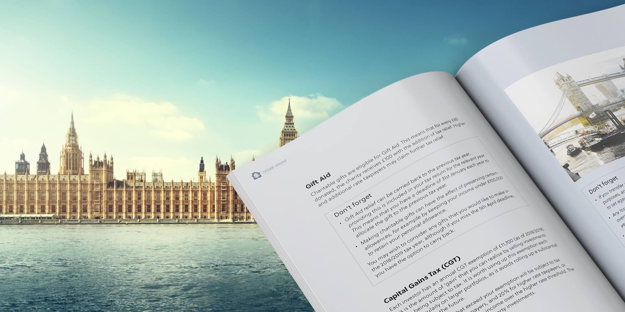
Financial planning PDF guides are an invaluable source of content. They add value to your clients, solve their pain points, help to position you as an industry leader and enable you to capture and nurture potential leads.
With so much potential, it’s important to ensure that your financial guide hits all the right points. At Clients Plus we specialise in creating high-quality digital content for financial planners. We know how to create engaging content that educates your clients.
Our team has pulled together the 6 hallmarks of a great PDF guide. So next time you’re creating a financial planning guide, follow this checklist!
1 – Valuable Content
Financial Planning guides can cover a wide range of topics; savings, pensions, tax, and so on. The key to a great guide is to choose topics that will appeal to your target audience, and solve their current pain points. In order to choose the right topic, first, you should create a list of ideas that are relevant to your current and potential clients. Then consider which of those topics are currently important (is the end of the tax year, for example?). The more engaging the content, the more valuable the guide.
2 – Attention-Grabbing Headlines
Your headline is the first aspect of your guide your audience will see. It needs to clearly convey what the guide is about, as well as explain the benefits of reading it. If you’re struggling to come up with a good headline, use the same practices for coming up with engaging blog and newsletter headlines.
3 – Eye-catching Images
Your audience will decide whether to read the full guide or not within a few seconds of picking it up. After your headline, the easiest way to grab the attention of your audience is through images. Try to avoid generic stock photographs where possible, and always choose images that are clear, professional, and accurately communicate the content of the guide.
4 – Simple and Effective Design
The design of your financial guide is just as important as the content. It’s equally important for your guide to look fresh and exciting, as well as easy to understand and navigate. Mistakes such as complicated page layouts or too many fonts will stop people from engaging with your guide. In turn making your brand appear unprofessional, and turn people away from your business.
5 – Easy to Read
Financial topics can be notoriously difficult to understand. A great financial planning guide should be both easy to read and understand. Good reliability is down to both copywriting and design. First, you need to ensure that the text on your brochure is easily read – dark fonts on light backgrounds, clear headlines, a decent size font, and use of white space. Second, the content needs to be written in an easy-to-understand format – explanations of industry terms, and bullet-point lists.
6 – Clear Branding and CTA
Ultimately your financial planning guide is to educate your audience, but it should also be used to capture potential leads. Give your audience a push in the right direction with a simple CTA (call to action), that tells them to get in touch if they need any further information or help. Make sure your branding and contact details are obvious, so your audience knows exactly who you are and how to contact you.
Are you looking to create a valuable financial planning PDF guide for your clients? Sign up to Clients Plus today to receive your free piece of expert-created financial planning content.


